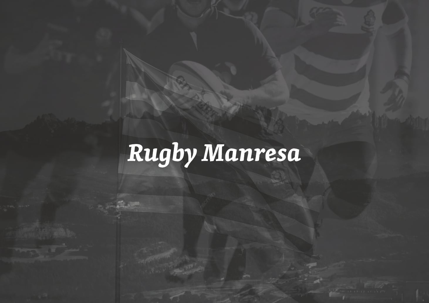
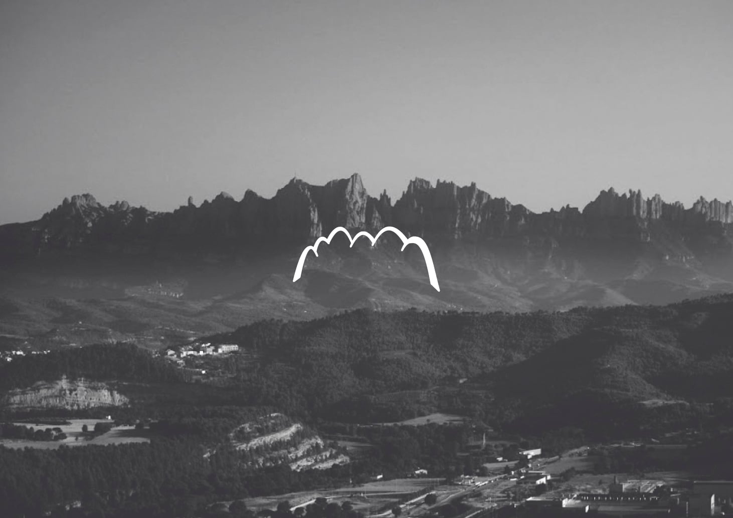
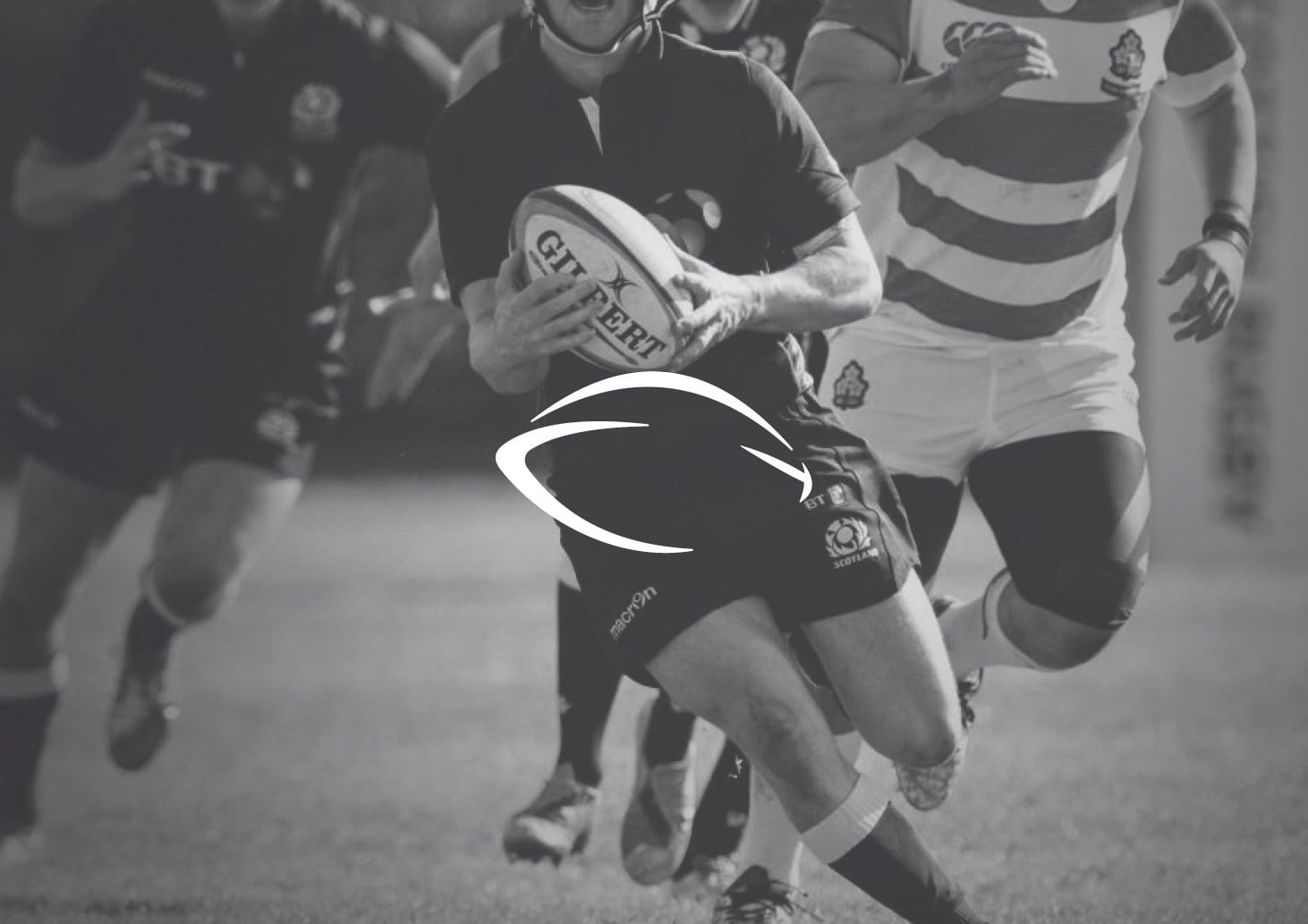
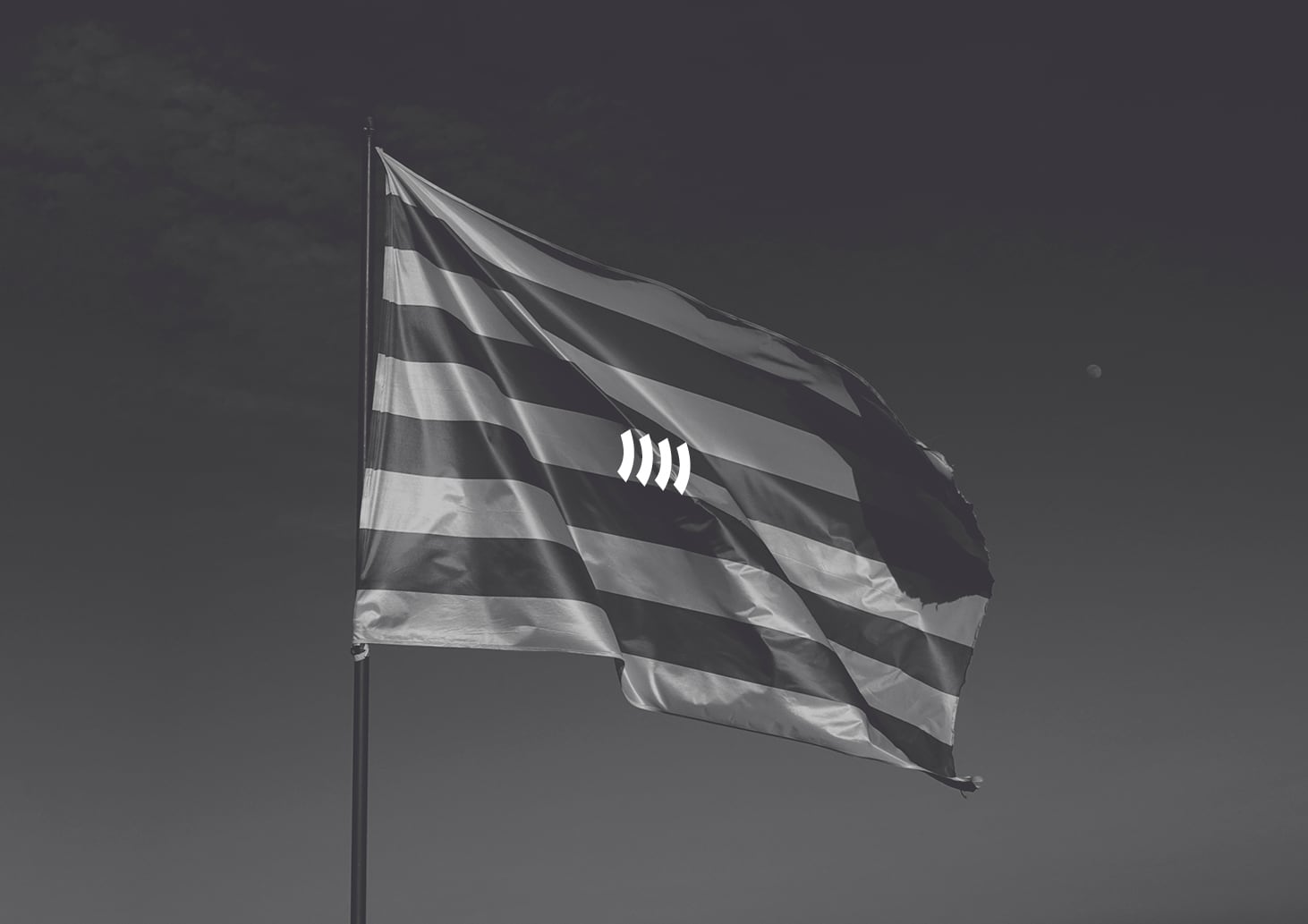
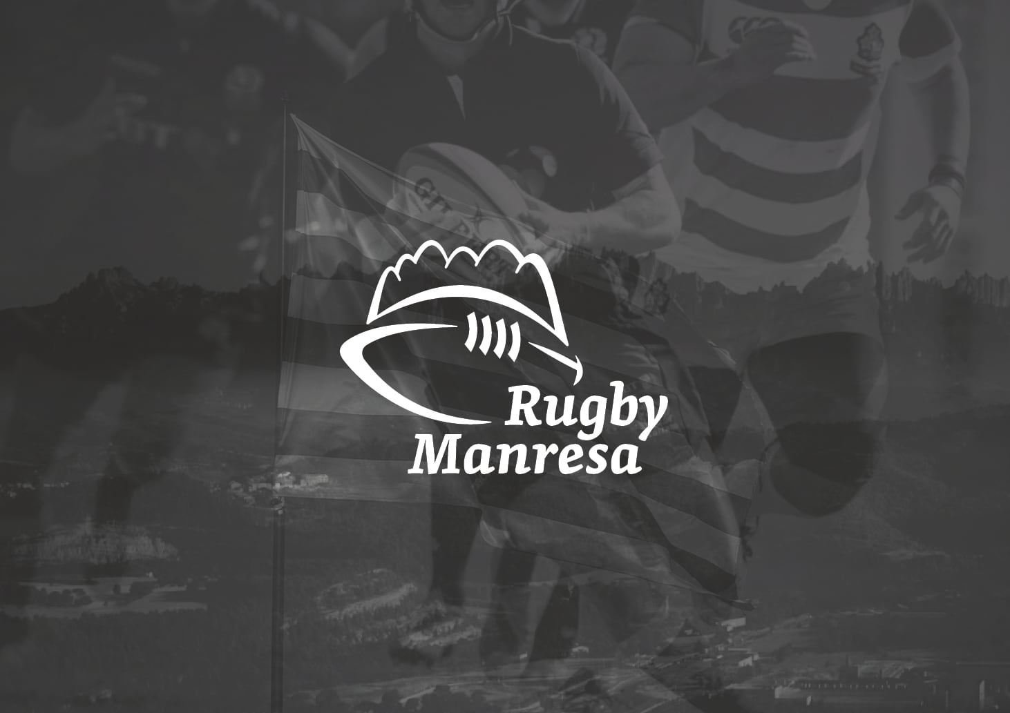
Visual identity created for Rugby Manresa. The image is intended to stand the passing of time thanks to an organic and solid stroke inspired in the geographical location of Manresa. The outline of Montserrat mountain range is added as an icon of the centre of Catalonia, a symbol of inspiration, magic and passion. Other images are the rugby ball and the four stripes of the Catalan national flag. The whole logo tries to move away from the classical traditional and historical coat of arms of most rugby teams. The new image perfectly fits reduction and works well in a single colour. The typography used is Skolar, which is definitely more modern compared with that used by most historical rugby clubs. The Skolar font is robust, designed to fulfill the needs of a serious typography, with a conventional proportion that provides comfortable reading. It offers credibility as well as a personal style. Photographs by Eder Pozo www.ederpozo.com

